
The same network, drawn properly
Maps and diagrams you can read, share and act on: geographic site maps, four topology views that live in the URL, and port-level capacity planning that cleans up after itself.

Most of 0.14.0 is one idea applied in several places: draw the network you already have so you can read it, send it, and act on it.
The topology page is the clearest example. Every control now lives in the URL, so the diagram you are looking at is the diagram a colleague opens when you paste them the link. The site map turned into real geography, with region boundaries and live monitoring on every marker. And ports learned to hold a reservation before the cable at the other end exists.
None of this replaces the wiring view, the photo faceplates, floor plans or monitoring you already had. It draws on top of them.
The release in two minutes
Prefer YouTube? Watch it there.
Topology: four views of the same network
The topology page now has four ways to draw the same devices. Pick the one that answers the question in front of you.
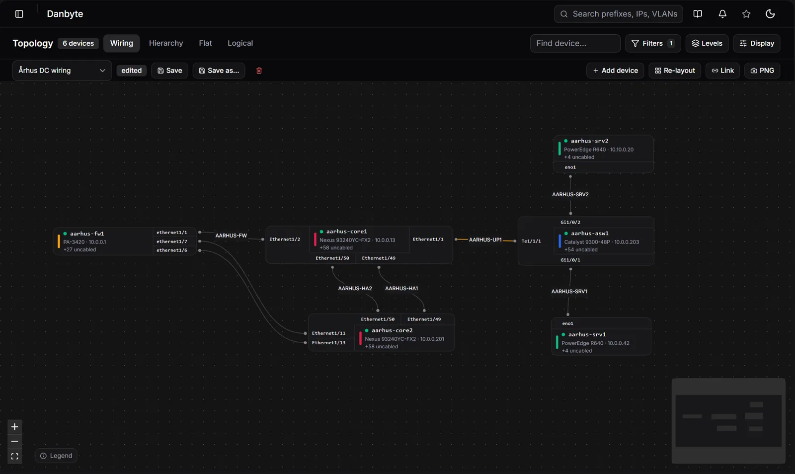
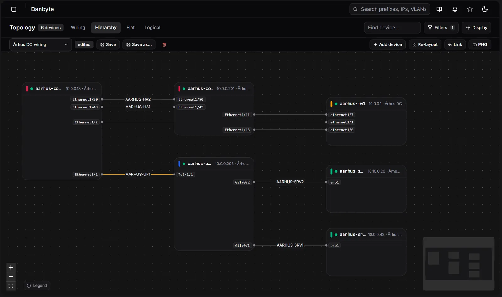
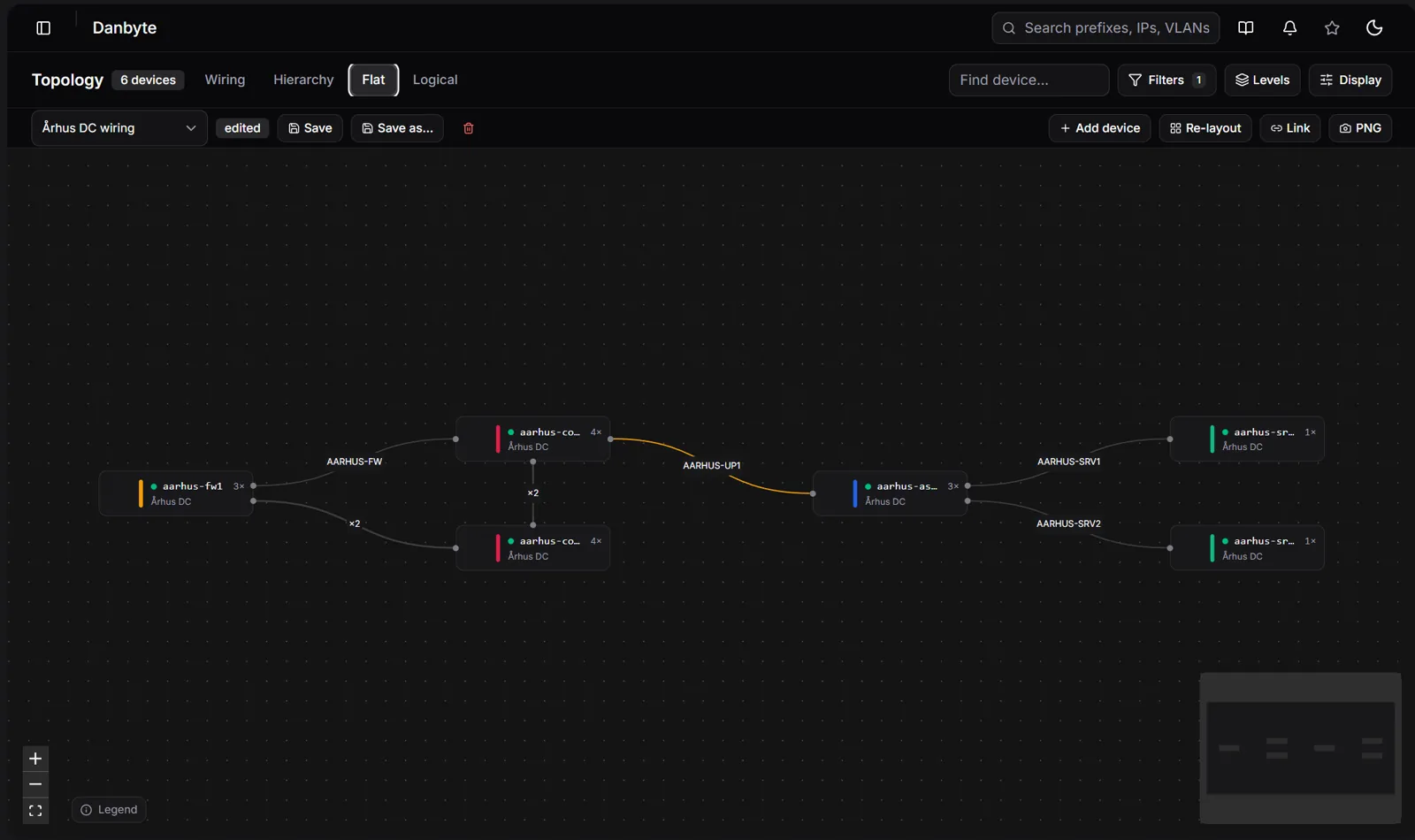
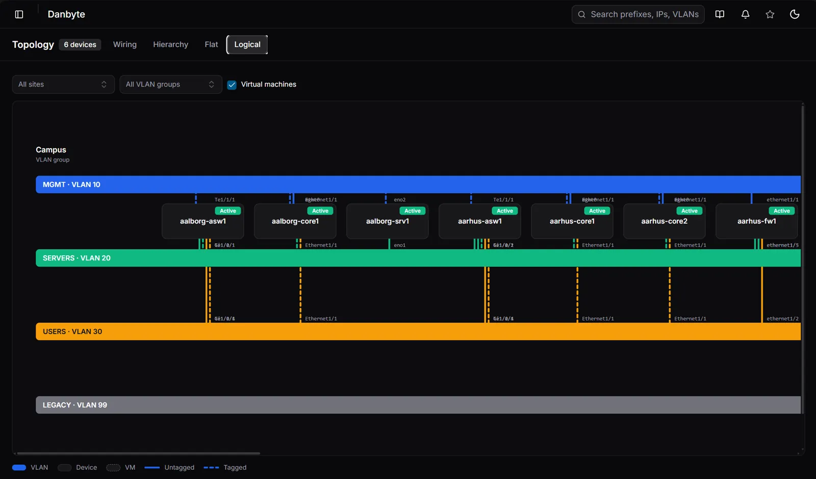
The single best thing here is not any one view. It is that every control now lives in the URL: the view style, filters, colours, routing and depth. Copy the link, send it, and the recipient opens the identical map. Bookmarks capture the whole thing.
Saved views remember hand-tuned layouts per view style, and show an "edited" marker the moment you deviate from a saved one. Alongside that: custom maps that start from a device and pull in its neighbours, click-to-spotlight a neighbourhood, speed-based cable colouring, a new curved cable routing, and PNG export.
The site map became geography
The site map used to be markers on a satellite tile. Now it is geography you can read at a glance.
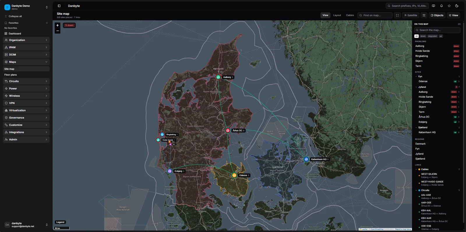
 OldNew
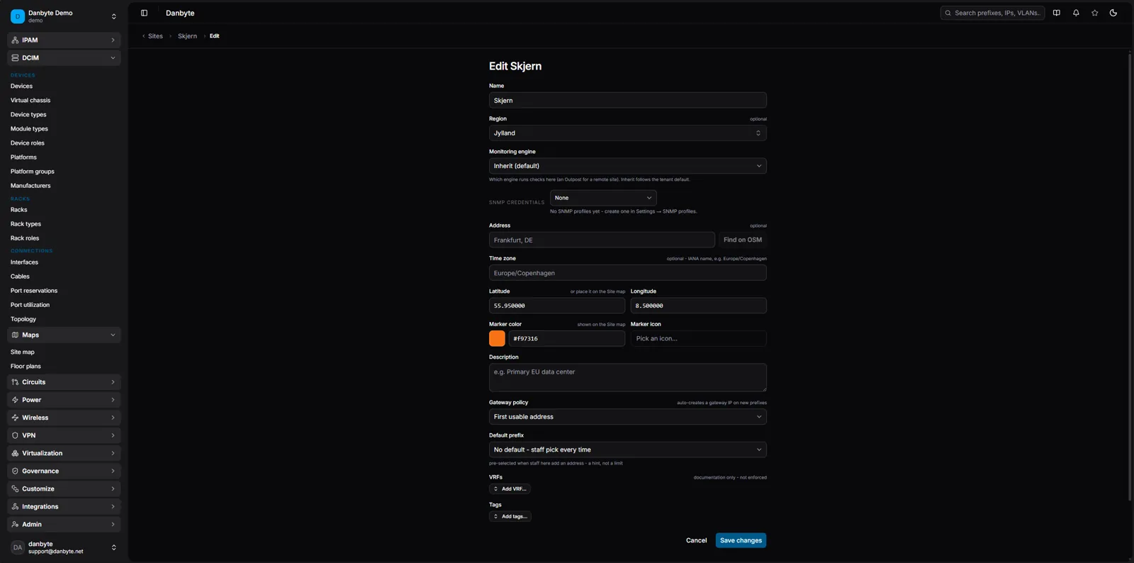
Regions pull real boundary polygons from OpenStreetMap and shade the map underneath. Sites carry their own colours and icons. Crowded areas cluster into chips that spread on click, or, with stacking off, markers shrink by density so nothing hides. Every marker wears its live monitoring state as a coloured ring, so the map shows what is up and down right now rather than a static drawing.
Links between sites are drawn as circuits and tunnels, not just cables, on their own toggleable layer. Click a line and a popover gives you type, status, fibre count and both device:port ends. Site names label at every zoom, addresses geocode as you type, and the same map is reused as a locator on site, location and region pages.
Capacity and planning on ports
Two new features answer the same question from opposite ends: is this port spoken for, and how full is this device?
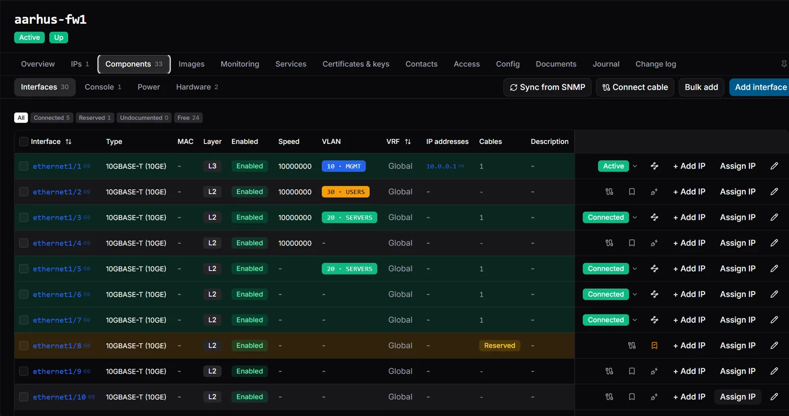
Port reservations let you hold a single uncabled port before you know where the other end goes, with a note and an owner. The port reads amber in the interface row, on the faceplate and in the counts. When a cable is finally connected, the hold releases itself. A tenant-wide list page shows every hold with filters and bulk release.
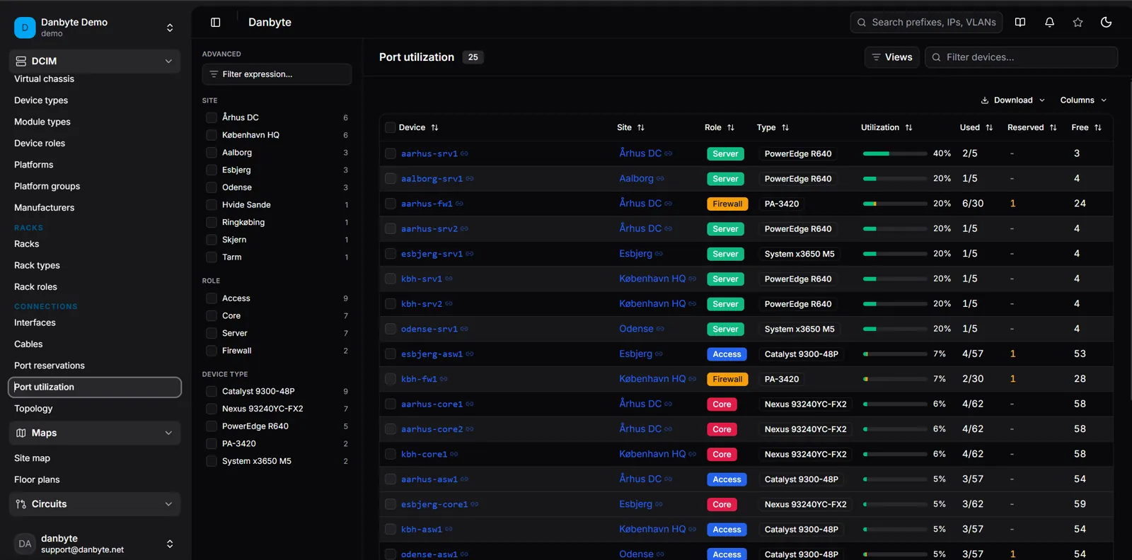
Port utilization reports connected, reserved and free for every device with ports, broken down per port kind. An estate-wide page sorts fullest-first, and alert rules can fire when a device crosses a threshold.
Two smaller changes round this out. "Mark connected", the flag for a cable that exists but is not documented, became a one-click row toggle with a badge and a row tint, instead of a checkbox buried in an edit form. And the photo-port editor got a sharper bulk tool: place a whole run of port markers on a device photo in one pass, previewed live before you commit, and re-lay an existing run when the alignment needs work.
Everyday interface
The sidebar was a flat list. It is now labelled sections with sticky headers, a clear active state, and a scrollable icon rail when collapsed.
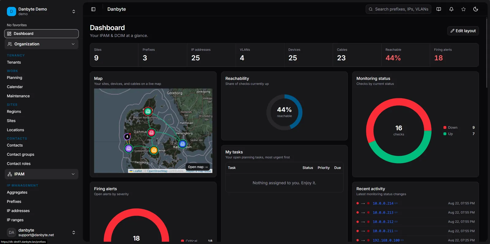
 OldNew
Change history now has one name everywhere: the change log, on the global page and on every per-object tab. Entries show a field-by-field before/after diff and link straight to the object they changed, and stop linking once that object is deleted. The user filter is a searchable dropdown of who actually made changes.
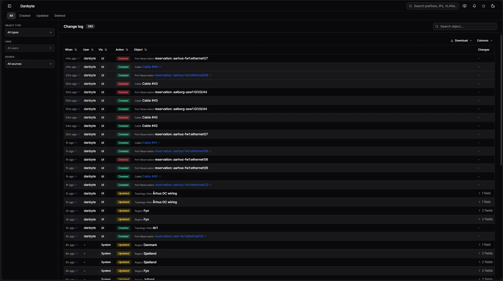
Edit forms are grouped into sections now, with rarely used groups folded away and summarising their own values while collapsed; your open and closed preferences are remembered. Forms opened from a device tab return you to that tab on save or cancel, instead of dropping you on a list page.
Data and integrations
DNS and DHCP no longer require the Windows sync integration. Zones, records, scopes and reservations are always available to author yourself; the toggle now governs only the sync machinery, and zones can be local with no server attached.
Services can bind ports per protocol, so one service is TCP 53 and UDP 53 at once, and monitoring checks each port with its own protocol. On the virtualization side, vCenter gained an allowed-networks list, synced ESXi host physical NICs and auto-linked vSwitch uplinks; Proxmox now shows readable platform names.
Rounding out the release: image attachments get a list view with type, size, dimensions and search; the Updates page shows a migration-drift warning when running code is behind the applied database schema; and the login page carries the Danbyte wordmark, with a custom-logo upload.
Upgrading
There are new database migrations across the api, core, audit, auth_api, integrations and monitoring apps. It is the standard upgrade path with no manual steps, but three things are worth knowing:
- The seeded "Planned" status colour changes from grey to amber, so row tints match the charts that already drew it amber. Statuses you have recoloured yourself are left alone.
- Port reservations are a new RBAC object type and default closed. Deployments using wildcard admin grants get it automatically; deployments with narrowly scoped permission sets must grant it before the reserve actions appear.
- The change-log renaming does not touch any URLs, so existing links and bookmarks keep working.